Form Structure
Forms are created using the <form> element. Inside the <form> element, we define form controls such as input fields, checkboxes, radio buttons, dropdowns, and buttons.
Example:
<form action="/submit" method="POST">
    <!-- Form controls go here -->
</form>
In this example, we have a basic form structure with an action attribute specifying the URL to which the form data will be submitted. The method attribute specifies the HTTP method to use when submitting the form (e.g., GET or POST).
Key attributes
- action — specifies where the form data is sent
- method — specifies how the data is sent (usually GET or POST)
If you don’t set method, the browser uses GET by default.
The <form> element itself does not display anything visually. Its purpose is to group form controls and manage data submission.
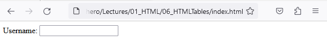
Labels
Label elements provide a descriptive text label for form controls, such as input fields, checkboxes, and radio buttons.
Associating labels with form controls improves usability by providing visual and interactive cues.
<form action="/submit" method="POST">
    <label for="username">Username:</label>
    <input type="text" id="username" name="username"/>
</form>
Why labels matter
- Clicking the label focuses the input
- Screen readers can announce the label
- Forms become easier to use and understand
The for attribute of <label> must match the id of the corresponding form control.

Input Fields
Input fields (<input/>) allow users to enter data. They can be used for various types of user input, such as text, numbers, dates, emails, and more. The type of form control which will be rendered with an input field is defined by its type attribute.
Example:
<input type="text" name="username" placeholder="Enter your username"/>
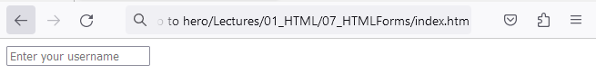
In this example, we have an input field of type "text" with a name attribute set to "username" and a placeholder text instructing the user to enter their username.
It is important to note the name attribute is used to reference the value of the element in form data after a form is submitted. The name attribute is also used in JavaScript to access and manipulate the element.
Important attributes
- type — defines the kind of input
- name — identifies the value when the form is submitted
- placeholder — shows a hint inside the input
The name attribute is essential because it determines how the data is sent to the server and accessed later.
Variations of the textbox input field which you can enter inside the type attribute are:
- text - renders a simple textbox
- email - renders a textbox for inputting emails
- password - renders a textbox for inputting passwords
- number - renders a textbox for inputting numbers
- date - renders a textbox for inputting dates
- time - renders a textbox for inputting time
<input type="text">
<input type="email">
<input type="password">
<input type="number">
<input type="date">
<input type="time">
Each input type provides built-in behavior and validation appropriate to the data being entered.
Alongside the type and name attributes, all of these controls can also have the following attributes defined:
- value - specifies the default value or the initial value of an input element.
- placeholder - provides a short hint or example of the expected input for the element. It is displayed in the input field before the user enters a value, typically as light gray text, and disappears when the user starts typing.
- maxlength - defines the maximum number of characters that a user can enter in an input field.
- disabled - a boolean (true or false) attribute that, when present, disables the input element. The value of the input field will not be sent when the form is submitted.
- readonly - an attribute that makes the input field read-only.
A read-only input field cannot be modified by the user, but the value of the input field will still be sent when the form is submitted.
- size - specifies the visible width of an input element, in terms of characters (for text, email, password, etc.).
- required - specifies a required field which the user must fill to be able to submit the form.
The min and max attributes are specific to the number, date and time fields:
- min - Defines the minimum value
- max - Defines the maximum value
While the step attribute is specific to the number and time fields and specifies a stepping interval.
Checkboxes and Radio Buttons
Checkboxes (<input type="checkbox">) and radio buttons (<input type="radio">) allow users to select multiple options (checkboxes) or choose a single option from a group (radio buttons).
Example:
<input type="checkbox" name="option1" value="Option 1" /> Option 1
<input type="checkbox" name="option2" value="Option 2"/> Option 2

<input type="radio" name="choice" value="Choice 1"/> Choice 1
<input type="radio" name="choice" value="Choice 2"/> Choice 2
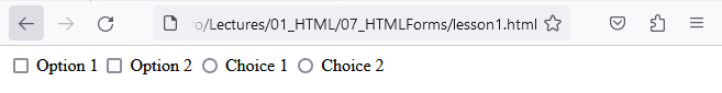
In this example, we have checkboxes and radio buttons with different names and values. Radio buttons are grouped by sharing the same name. Checkboxes can share a name too, but it depends on how you want to submit the data, and the value attribute specifies the value associated with each option.
Key differences
- Checkboxes allow multiple selections
- Radio buttons allow only one selection per group
Radio buttons are grouped by sharing the same name attribute.
Alongside the type and name attributes, checkboxes and radio buttons can also have the following attributes specified: value, disabled, readonly and required.
Checkboxes and radio buttons can also have the checked attribute which specifies a button checked by default, as in the example below.
<input type="checkbox" name="option1" value="Option 1" checked="checked" /> Option 1
<input type="checkbox" name="option2" value="Option 2"/> Option 2
Select Dropdowns
Select dropdowns (<select>) provide users with a list of options from which they can choose.
Example:
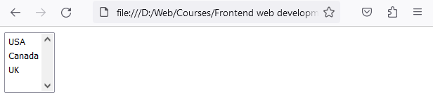
<select name="country">
    <option value="usa">USA</option>
    <option value="canada">Canada</option>
    <option value="uk">UK</option>
</select>
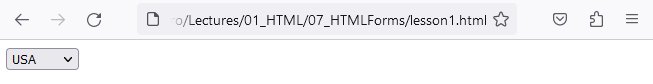
In this example, we have a select dropdown for choosing a country. Each <option> represents an available choice, with the value attribute specifying the value associated with the selected option.
Alongside the name attribute, select dropdowns can also have the following attributes specified: value, disabled, multiple and required.
The <option> elements can have the selected attribute to define default selection, like in the example below:
<select name="country">
    <option value="usa" selected>USA</option>
    <option value="canada">Canada</option>
    <option value="uk">UK</option>
</select>
One specific attribute for the <select> element is multiple, which allows multiple selection. To select multiple options, the user must hold CTRL on the keyboard and click on the desired options.
Example:
<select name="country" multiple>
    <option value="usa">USA</option>
    <option value="canada">Canada</option>
    <option value="uk">UK</option>
</select>
Textarea
The <textarea> element is used in HTML to create a multi-line text input field that the user can type into.
Example:
<textarea name="message" rows="3" cols="50">Default message</textarea>
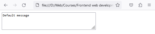
In this example, we have a textarea element with the name="message" attribute. The user can type a message into the textarea, and when they submit the form, the content of the textarea will be included in the form data with the name "message".
This textarea also has rows and cols defined, which define the visible width (cols) and height (rows) of the textarea, in terms of character units.
The <textarea> element does not have the value attribute, if you were to add a default value inside the textarea, you would simply put it as the element's content, but it supports most of the same attributes as <input type=”text”/>, such as: placeholder, maxlength, required, readonly and disabled.
File upload
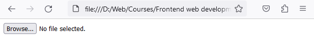
The <input type="file"/> element renders a control for selecting and uploading files.
<input type="file" name="FileUpload"/>
As all other form controls, it can accept attributes: name, required and disabled. While specific attributes of the file upload field are:
- accept - Specifies the types of files that the server accepts. Helps in filtering the file chooser dialog to show only files with the specified MIME types. Accepts comma separated MIME types e.q. (image/png, image/jpeg).
- multiple - A boolean attribute that allows the user to select and upload multiple files. Enables the uploading of multiple files at once.
<input type="file" name="FileUpload" accept="image/png, image/jpeg" multiple />
The example above allows upload of multiple files of type .png and .jpeg
When uploading files, the <form> should also include enctype="multipart/form-data" so the file can be sent correctly.
Buttons
Buttons (<button>) allow users to perform actions within the form, such as submitting the form or resetting input fields.
Example:
<button type="submit">Submit</button>
<button type="reset">Reset</button>
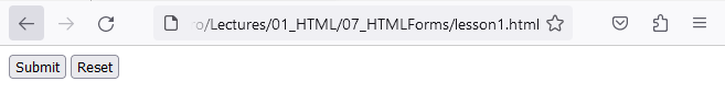
In this example, we have buttons with different types. The type="submit" button submits the form, and the type="reset" button resets the input fields.
Hands-On Exercise: Complete Form Example
Exercise:
Here's an example of a complete HTML form incorporating all the possible variations:
<form action="/submit" method="POST">
        <div>
            <label for="name">Name:</label>
            <input type="text" id="name" name="name" placeholder="Enter your name" required/>
        </div>
        <div>
            <label for="email">Email:</label>
            <input type="email" id="email" name="email" placeholder="Enter your email" required/>
        </div>
        <div>
            <label for="password">Password:</label>
            <input type="password" id="password" name="password" placeholder="Enter your password" required/>
        </div>
        <div>
            <label for="gender">Gender:</label>
            <input type="radio" id="male" name="gender" value="male"/>
            <label for="male">Male</label>
            <input type="radio" id="female" name="gender" value="female"/>
            <label for="female">Female</label>
        </div>
        <div>
            <label for="country">Country:</label>
            <select id="country" name="country">
            <option value="germany">Germany</option>
            <option value="canada">Canada</option>
            <option value="uk">UK</option>
            </select>
        </div>
        <div>
            <label for="terms">I agree to the terms and conditions:</label>
            <input type="checkbox" id="terms" name="terms" required/>
        </div>
        <div>
            <button type="submit">Submit</button>
            <button type="reset">Reset</button>
        </div>
</form>
This code will render the following when viewed in a browser.
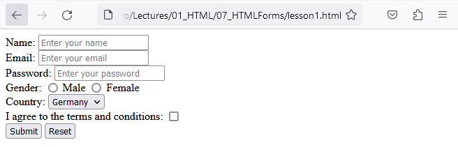
In this example, we have included input fields for name, email, and password, radio buttons for gender selection, a select dropdown for choosing a country, and a checkbox for agreeing to the terms and conditions. The form includes buttons for submitting the form and resetting the input fields.
All Form Elements
- Text Input (<input type="text"/>): Allows users to enter a single line of text.
- Password Input (<input type="password"/>): Masks the entered text, useful for password fields.
- Email Input (<input type="email"/>): Validates the input to ensure it follows the email format.
- Number Input (<input type="number"/>): Restricts the input to numeric values only.
- Checkbox Input (<input type="checkbox"/>): Represents a binary choice, checked or unchecked.
- Radio Buttons (<input type="radio"/>): Represents a selection of mutually exclusive options.
- File Upload (<input type="file"/>): Allows users to select and upload files.
- Date Input (<input type="date"/>): Enables selection of a specific date using a date picker.
- Time Input (<input type="time"/>): Enables selection of a specific time using a time picker.
- Dropdown Select (<select></select>): Presents a list of options (<option>) for selection.
- Textarea(<textarea></textarea>): Allows users to enter multiple lines of text.
- Submit Button(<button type="submit">): Triggers the form submission.
- Reset Button(<button type="reset">): Resets the form fields.
By understanding the structure and usage of HTML forms, you can create interactive and user-friendly web pages. Practice creating forms with different input fields, checkboxes, radio buttons, dropdowns, and buttons to gain proficiency in this important aspect of web development.
Conclusion
HTML forms are essential for building interactive websites. By understanding form structure and controls, you can collect user input effectively and prepare your pages for backend processing and validation.
In the next lesson, you’ll continue building your HTML skills as you explore more advanced concepts that build on forms, GET and POST Requests.