Typography in CSS
Typography in CSS includes a range of properties that allow you to control the appearance of text on your web pages. These properties include font-family, font-size, font-weight, line-height, text-align, text-transform, color, letter-spacing, and more.
- font-family: Specifies the typeface that should be used to render the text.
- font-size: Controls the size of the text.
- font-weight: Defines how bold the text should be.
- line-height: Specifies the height of a line.
- text-align: Controls the horizontal alignment of text.
- text-transform: Allows you to control the capitalization of text.
- color: Defines the color of the text.
- letter-spacing: Controls the amount of space between letters.
Here's an example that uses various typography properties:
HTML
<p>This is a paragraph of text.</p>
CSS
p {
  font-family: Arial, sans-serif;
  font-size: 20px;
  font-weight: bold;
  line-height: 1.5;
  text-align: justify;
  text-transform: uppercase;
  color: blue;
  letter-spacing: 2px;
}
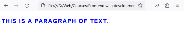
In this example, paragraph text will use the Arial font (or the default sans-serif font if Arial is not available), have a size of 20px, be bold, have a line-height of 1.5 times the size of the font, be justified on both sides, be transformed to uppercase, have a color of blue, and have a letter spacing of 2px.
Font family
The CSS font-family property is used to specify the typeface that will be used for the text inside an element. This property can hold several font names as a "fallback" system, to ensure maximum compatibility between browsers and operating systems.
body {
  font-family: Arial, Helvetica, sans-serif;
}
In the example above, "Times New Roman" is the first choice font, Times is the second, and any serif font is the third and final option.
Remember that the font you choose must be installed on the user's computer, or loaded from a web service like Google Fonts:
@import url('https://fonts.googleapis.com/css2?family=Roboto&display=swap');

body {
  font-family: 'Roboto', sans-serif;
}
In the example above, the @import rule is used to import the Roboto font from Google Fonts. The font-family property then specifies 'Roboto' as the first choice font, falling back to any sans-serif font if Roboto is not available.
Font size
The CSS font-size property is used to set the size of the font. You can use different units of measurement to specify font size, including pixels (px), ems (em), rems (rem), and percentages (%).
Here is an example using pixels:
p.small {
  font-size: 12px;
}

p.large {
  font-size: 20px;
}
In this example, the paragraph with the class "small" will have a font-size of 12 pixels, and the paragraph with the class "large" will have a font-size of 20 pixels.
The em unit is a scalable unit that is used in web document media. An em is equal to the current font-size, for instance, if the font-size of the document is 12pt, 1em is equal to 12pt. Ems are scalable in nature, so 2em would equal 24pt, .5em would equal 6pt, etc.
p {
  font-size: 2em; /* equivalent to 24px if base size is 12px */
}
The rem, or root em, works similarly to the em, except that it will always equal the size of the root element's font size, not the parent element.
p {
   /* if root html element has a font size of 16px, this results in 32px */
  font-size: 2rem;
}
The benefit of using em and rem over pixels is that they are scalable. This means they can easily adjust to the viewer's screen or preferences. Pixels are fixed-size units and do not change based on the size of the screen or browser window. This can make em and rem units a better choice for responsive web design.
Font weight
The CSS font-weight property is used to set the weight or thickness of the font. The font weights available will depend on the font-family that you are using. Some fonts will only have a normal and bold weight, while others will have multiple numeric weights.
Here is an example:
p.normal {
  font-weight: normal;
}

p.thick {
  font-weight: bold;
}
In this example, the paragraph with class "normal" will have a normal font weight, and the paragraph with class "thick" will have a bold font weight.
If a numeric weight is available for your font, you can specify it with numbers from 100 to 900, where 400 is normal and 700 is the same as bold.
p.extra-light {
  font-weight: 200;
}

p.extra-bold {
  font-weight: 800;
}
In the example above, the paragraph with class "extra-light" will have a font-weight of 200, which is lighter than normal, and the paragraph with class "extra-bold" will have a font-weight of 800, which is bolder than bold.
Remember that not all fonts will support all weights. If a font doesn't support a specific weight, the browser will default to the closest available weight.
Line height
The CSS line-height property is used to specify the amount of space used by a line of text. This property affects the vertical spacing between lines of text, and it can be specified with different types of units, including px, em, rem, and unitless values.
Here is an example using pixels:
p.small {
  line-height: 14px;
}

p.large {
  line-height: 24px;
}
In this example, the paragraph with class "small" will have a line-height of 14 pixels, and the paragraph with class "large" will have a line-height of 24 pixels.
Similar to the font-size property, you can also use em or rem units to define line-height:
p {
  font-size: 16px;
  line-height: 1.5em;   /* equivalent to 24px */
}
Here, the line-height is 1.5 times the size of the font-size, resulting in a line-height of 24 pixels.
Unitless line-heights are often a good choice because they are relative to the font-size of the element, not the parent. This means that the line height scales with the font-size:
p {
  font-size: 16px;
  line-height: 1.5;   /* equivalent to 24px */
}
This sets the line-height to 1.5 times the size of the font. If the font-size were to increase or decrease, the line-height would adjust proportionally, maintaining vertical rhythm.
The line-height property is important for improving the legibility of large blocks of text. A good base line-height value is typically between 1.5 and 2.
Text align
The CSS text-align property is used to align the text of an element. It can take the following values: left, right, center, or justify.
Here's an example:
p.left {
  text-align: left;
}

p.right {
  text-align: right;
}

p.center {
  text-align: center;
}

p.justify {
  text-align: justify;
}
In this example, text in a paragraph with the class "left" will be aligned to the left, and similarly for "right" and "center". The "justify" value aligns text both left and right, adding extra space between words as necessary so that each line of text fits the entire width of the line box.
Remember, text in English and other left-to-right languages is left-aligned by default. Text in right-to-left languages like Arabic or Hebrew is right-aligned by default.
The text-align property is incredibly useful for styling headings, setting up blocks of text, and creating more appealing visual layouts.
Text transform
The CSS text-transform property is used to change the text case of an element. This property can take the following values: none, capitalize, uppercase, or lowercase.
Here's an example:
p.capitalize {
  text-transform: capitalize;
}

p.uppercase {
  text-transform: uppercase;
}

p.lowercase {
  text-transform: lowercase;
}
In this example, the first letter of each word in a paragraph with class "capitalize" will be capitalized. In a paragraph with class "uppercase", all the letters will be in uppercase, and similarly for "lowercase".
Color
Colors in CSS can be defined in several ways, allowing for a full spectrum of colors to be used in your styles. CSS supports named colors, hexadecimal, RGB, RGBA, HSL, and HSLA color values.
- Named Colors: There are 147 named color values, like red, blue, yellow, green, etc.
- Hexadecimal Colors: A six-digit, three-byte hexadecimal number preceded by a hash (#), e.g., #FF0000 for red.
- RGB and RGBA Colors: Defines colors using Red, Green, Blue values (and optionally, Alpha for opacity) in the range of 0-255, e.g., rgb(255,0,0) for red, rgba(255,0,0,0.5) for semi-transparent red.
- HSL and HSLA Colors: Defines colors using Hue, Saturation, Lightness (and optionally, Alpha for opacity), e.g., hsl(0,100%,50%) for red, hsla(0,100%,50%,0.5) for semi-transparent red.
Example:
p.red {
  color: red; /* Key word */
}

p.green {
  color: #008000; /* HEX value */
}

p.blue {
  color: rgb(0,0,255); /* RGB value */
}

p.blue-transparent {
  color: rgba(0,0,255, 0.5); /* RGBA value */
}
In this example, text in a paragraph with class "red" will be colored red. The paragraph with class "green" will be colored green using a hexadecimal color, and the paragraph with class "blue" will be colored blue using an RGB color.
Letter spacing
The CSS letter-spacing property is used to specify the space between the characters in a text.
p.normal {
  letter-spacing: normal;
}

p.wide {
  letter-spacing: 0.2em;
}

p.tight {
  letter-spacing: -0.05em;
}
In this example, a paragraph with class "normal" will have normal letter spacing. The paragraph with class "wide" will have more space between letters, and the paragraph with class "tight" will have less space between letters.
Remember, letter-spacing can take different types of units, but em is often a good choice because it is relative to the font-size of the text.
Word-Wrap
The word-wrap property in CSS is used to specify whether the browser can break lines within words to prevent overflow when an otherwise unbreakable string is too long to fit within its containing box.
There are two values for the word-wrap property:
- normal: Break words only at allowed break points (like spaces).
- break-word: Allows unbreakable words to be broken.
Example usage:
p {
  word-wrap: break-word;
}
In this case, if a paragraph <p> contains a word that's too long to fit within the element's width, the word will be broken at the appropriate point to ensure it doesn't overflow its container.
Understanding how to use word-wrap ensures your text content is always readable and neatly formatted, no matter its length.
Text Shadow
The text-shadow property is used to cast a shadow behind an element. It's versatile and can be used to produce various effects like depth, focus, or even inner shadows. This property accepts a comma-separated list of shadows to be applied to the text.
This property accepts a comma-separated list of shadows to be applied to the text.
The property generally has the following values: horizontal offset, vertical offset, blur radius, spread radius, and color.
Simple Shadow:
.text {
    text-shadow: 5px 5px 15px rgba(0, 0, 0, 0.3);
    /* Horizontal offset: 5px,
       Vertical offset: 5px,
       Blur: 15px,
       Color: semi-transparent black */
}
To add more than one shadow to the text, add a comma-separated list of shadows.
The text-shadow property allows for nuanced changes in design, adding depth, focus, and overall visual appeal.
Loading custom fonts (@font-face)
To load custom font families, we use the @font-face property. @font-face is a CSS at-rule used to define custom fonts. With @font-face, you can specify your own font file to be loaded and used on the webpage. This allows you to use fonts that aren't installed on the user's device.
Here's a basic example of how to use @font-face:
@font-face {
  font-family: 'MyCustomFont';
  src: url('MyCustomFont.woff2') format('woff2'),
       url('MyCustomFont.woff') format('woff');
}
In this example, 'MyCustomFont' is the name you'll use to reference this font in other CSS rules. The src property specifies the path to the font file. You can provide multiple paths with different font formats for better browser compatibility. After defining the font, you can use it like any other font with the font-family property:
body {
  font-family: 'MyCustomFont', sans-serif;
}
In this example, if 'MyCustomFont' is not available for some reason, the browser will fall back to a default sans-serif font.