Translate
The translate() CSS function repositions an element in the 2D space. It moves the element from its current position.
transform: translate(x, y);
- X is the horizontal move (left or right).
- Y is the vertical move (up or down)
For X and Y you can use absolute or relative units as well as positive and negative values.
Here's an example of how to use CSS transforms:
div  {
    width: 60px;
    height: 60px;
    text-align: center;
    border: 1px solid black;
    /* This will move the element 50 pixels to the right and 20 pixels down */
    transform: translate(50px, 20px);
}
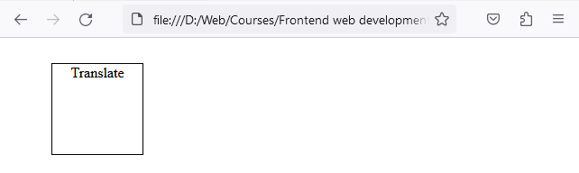
In this example, the <div> is moved 50px to the right and 20px down from its original position.
Rotate
The rotate() CSS function rotates an element around a fixed point, which by default is the center of the element.
transform: rotate(angle);
-
angle defines the rotation's magnitude and direction. It can be in degrees (deg), radians (rad), turns, etc.
div {
  width: 60px;
  height: 60px;
  margin: 0 auto;
  border: 1px solid black;
  text-align: center;
  /* This will rotate the element 20 degrees clockwise */
  transform: rotate(20deg);
}
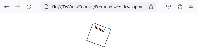
In this example, the <div> is rotated 20 degrees clockwise. Use negative angles (e.g., -20deg) to rotate counterclockwise.
Scale
The scale() CSS function resizes an element. It can increase or decrease the size based on the scaling factor provided.
transform: scale(X, Y);
- X scales the element horizontally.
- Y scales the element vertically.
div  {
    width: 60px;
    height: 60px;
    margin: 0 auto;
    text-align: center;
    border: 1px solid black;
    /* This will double the size of the element */
    transform: scale(2);
}
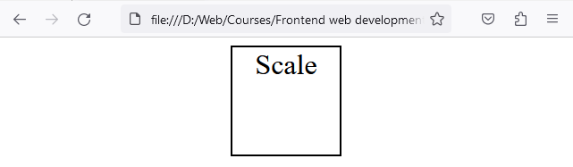
Here, the <div> is 2 times its original width and its original height.
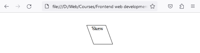
Skew
The skewX() and skewY() CSS functions skew an element along the X-axis and Y-axis respectively. This can create a slanting or distorting effect.
transform: skewX(angle);
transform: skewY(angle);
- angle defines the skew's magnitude and direction.
div {
  width: 60px;
  height: 60px;
  margin: 0 auto;
  text-align: center;
  border: 1px solid black;
  /* This will skew the element 20 degrees along the X-axis */
  transform: skewX(20deg);
}
In this example, the <div> is skewed 20 degrees along the X-axis..
Transform shorthand
You can combine multiple transform functions in a single transform property. For example:
.box {
  transform: translate(50px, 100px) rotate(45deg) scale(1.5) skewX(10deg);
}
- Remember to test transforms on various browsers to ensure cross-browser compatibility.
- Consider using CSS transitions or animations to smoothly apply these transformations over time.
Next, we’ll build on transforms by animating them smoothly in the CSS Transitions and Animations lesson. If you want these transforms to feel smooth and interactive, pair them with transitions.