The two axes of flexbox
Flexbox operates along two primary axes — the main axis and the cross axis. The direction of the main axis is set by the flex-direction property, while the cross axis runs at a right angle to it. All Flexbox layout behavior depends on these axes, so understanding them early is essential.
The main axis
The main axis's direction is determined by the flex-direction property, which can take on four possible values:
- row
- row-reverse
- column
- column-reverse
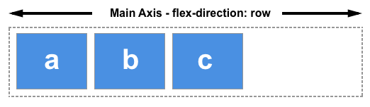
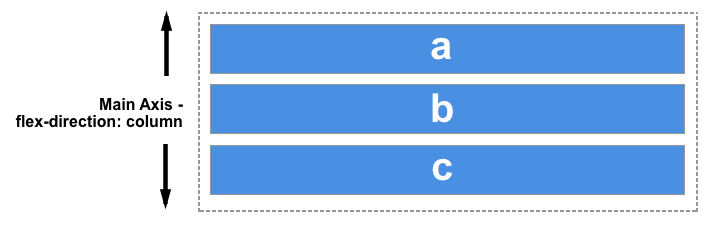
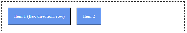
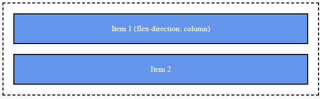
If you choose row or row-reverse, the main axis stretches along the row in the inline direction. Conversely, selecting column or column-reverse makes the main axis extend from the top to the bottom of the page, following the block direction.
Choose column or column-reverse and your main axis will run from the top of the page to the bottom — in the block direction.
The cross axis
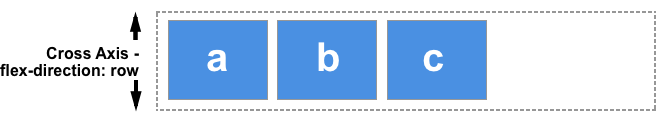
The cross axis runs at a right angle to the main axis. Therefore, if your flex-direction (main axis) is either row or row-reverse, the cross axis goes down the columns.
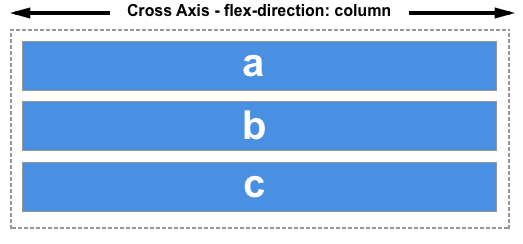
If the main axis is column or column-reverse, then the cross axis traverses along the rows.
Start and end lines
A critical point to note about flexbox is that it doesn't pre-suppose the writing mode of the document. Unlike previous CSS methods that predominantly favored horizontal and left-to-right writing modes, contemporary layout methods cover a spectrum of writing modes, eliminating assumptions that a text line begins at the top left of a document and continues towards the right, with new lines appearing below one another.
It's essential to understand why, when discussing the direction of our flex items flow, we don't refer to left and right or top and bottom. If the flex-direction is row and I'm working in English, the main axis's start edge will be on the left, and the end edge on the right.
If I'm working in Arabic, the main axis's start edge would be on the right and the end edge on the left.
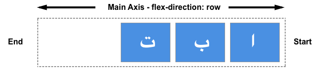
In both scenarios, the start edge of the cross axis is at the top of the flex container and the end edge at the bottom, given both languages employ a horizontal writing mode.
After some time, thinking about the start and end rather than left and right becomes second nature and will prove beneficial when working with other layout methods such as CSS Grid Layout, which follow the same conventions.
Flex Container
A flex container is any element whose children are laid out using the Flexbox layout model. To create a flex container, we set the value of the area's container's display property to flex or inline-flex.
- display: Defines a flex container.
- flex-direction: Defines the direction items are placed in the container.
- flex-wrap: Specifies whether items should wrap or not.
- flex-flow: Shorthand for flex-direction and flex-wrap.
- justify-content: Defines the alignment along the main axis.
- align-items: Defines the default behavior for how items are laid out along the cross axis.
- align-content: Similar to align-items, but for multiple lines of items.
.container {
  display: flex;
}
Flex Direction
Once you have a flex container, you can set the direction of the flex items. By default, they are set to row, meaning they align horizontally. But you can also set them to column for vertical alignment. This is done using the flex-direction property:
.container {
  display: flex;
  flex-direction: row; /* default value; can be omitted */
}
.container {
  display: flex;
  flex-direction: column;
}
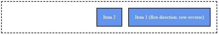
You can also reverse the order of the items using row-reverse or column-reverse:
.container {
  display: flex;
  flex-direction: row-reverse;
}
Flex Wrap
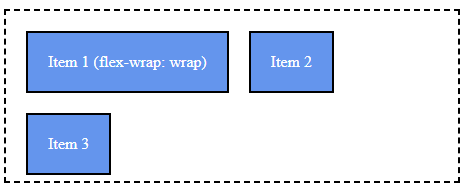
By default, flex items will try to fit onto one line. To change this, use the flex-wrap property:
.container {
  display: flex;
  flex-wrap: wrap; /* allows items to wrap onto multiple lines */
}
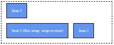
You can also use wrap-reverse to wrap items onto multiple lines in reverse order.
.container {
  display: flex;
  flex-wrap: wrap-reverse; /* allows items to wrap onto multiple lines */
}
Flex Flow
The flex-flow property is a shorthand property for setting flex-direction and flex-wrap. The default is row nowrap:
.container {
  display: flex;
  flex-flow: row wrap;
}
Justify Content
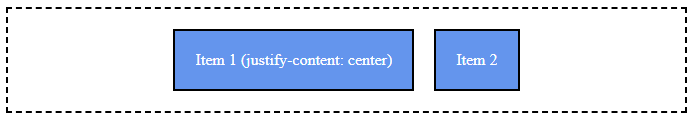
The justify-content property aligns flex items along the main axis of the flex container.
center: This aligns items to the center of the flex container.
.container {
  display: flex;
  justify-content: center; /* centers items horizontally */
}
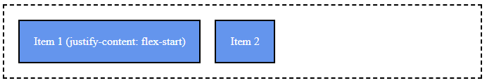
flex-start: This aligns items to the start of the flex container.
.container {
  display: flex;
  justify-content: flex-start;
}
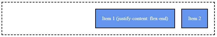
flex-end: This aligns items to the end of the flex container.
.container {
  display: flex;
  justify-content: flex-end;
}
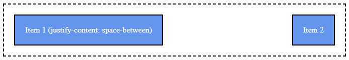
space-between: This aligns items so that the first item is at the start, the last item is at the end, and all remaining space is distributed evenly between the items.
.container {
  display: flex;
  justify-content: space-between;
}
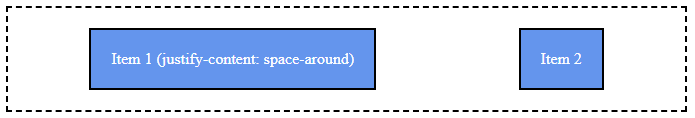
space-around: This aligns items so that there are equal spaces around them. The space between the first/last item and the container edge is half the space between items.
.container {
  display: flex;
  justify-content: space-around;
}
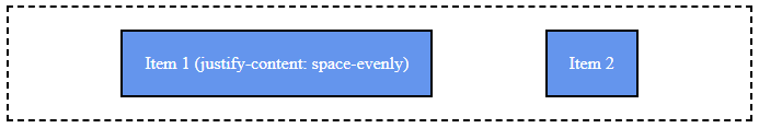
space-evenly: This aligns items so that there is an equal amount of space between each item, and between the items and the edges of the container.
.container {
  display: flex;
  justify-content: space-evenly;
}
With the above properties, you can easily control the alignment and distribution of your flex items.
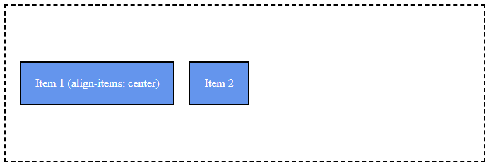
Align Items
The align-items property aligns flex items along the cross axis of the flex container.
Other values for align-items include flex-start, flex-end, baseline, and stretch.
.container {
  display: flex;
  align-items: center; /* centers items vertically */
}
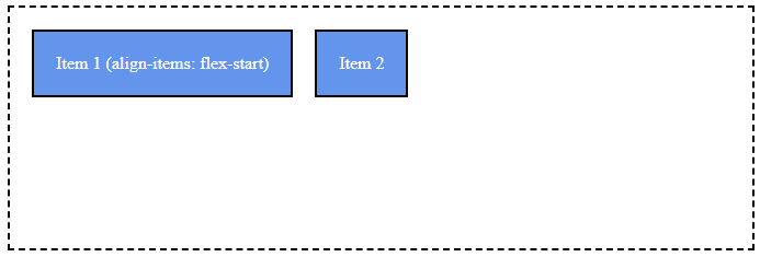
flex-start: This aligns items to the start of the flex container.
.container {
  display: flex;
  align-items: flex-start;
}
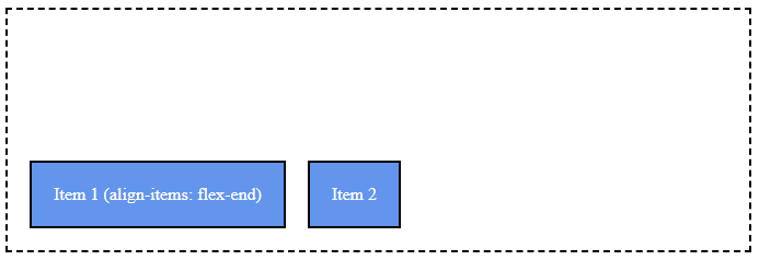
.container {
  display: flex;
  align-items: flex-end;
}
center: This aligns items to the center of the flex container.
.container {
  display: flex;
  align-items: center;
}
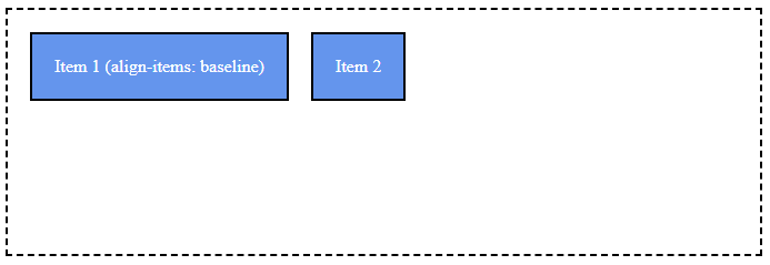
baseline: This aligns items along their baseline. The baseline is where the text sits.
.container {
  display: flex;
  align-items: baseline;
}
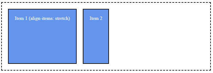
stretch: This stretches the items to fill the container. If you don't specify a height, or set it to auto, the items will stretch to fill the container vertically.
.container {
  display: flex;
  align-items: stretch;
}
Flex Item
Flex Items are direct children of a Flex Container (elements with display: flex or display: inline-flex).
- order: Controls the order in which items appear within the flex container.
- flex-grow: Determines how much a flex item will grow relative to the rest of the flex items.
- flex-shrink: Determines how much a flex item will shrink relative to the rest of the flex items.
- flex-basis: Specifies the initial main size of a flex item.
- flex: Shorthand for flex-grow, flex-shrink, and flex-basis.
- align-self: Allows for overriding a flex container's align-items value for individual flex items.
Here's an example of a basic flex container and flex items:
.container {
  display: flex;
  justify-content: space-around;
}

.item {
  flex-grow: 1;
}
Flex Grow, Shrink, and Basis
You can use the flex shorthand to set these three properties at once. The flex property takes the grow, shrink, and basis values, in that order:
.item {
  flex: 1 0 auto;
}
Flexbox is one-dimensional. For full two-dimensional layouts, continue with CSS Grid.