CSS Color Systems Overview
CSS provides several ways to define colors:
- Named colors – simple and readable
- HEX values – compact and widely used
- RGB / RGBA – screen-based color control
- HSL / HSLA – human-friendly color manipulation
Let’s explore each one step by step.
Named Colors
CSS has a predefined set of named colors. Some of the values can be: red, blue, yellow, green etc. For beginners, these are the easiest to remember and use.
Example:
p {
    color: red;
}
This styles all <p> elements with red text.
When to Use Named Colors
✔ Learning and quick demos
✔ Simple prototypes
✔ Very basic styling
⚠️ Not recommended for large projects due to limited control and inconsistency across palettes.
HEX Values
Hexadecimal (HEX) color values are based on the combination of red, green, and blue (RGB) values in a base-16 format. A HEX color code starts with a hash # followed by 6 characters - two for red, two for green, and two for blue.
Example:
div {
    background-color: #FF5733; /* A shade of orange */
}
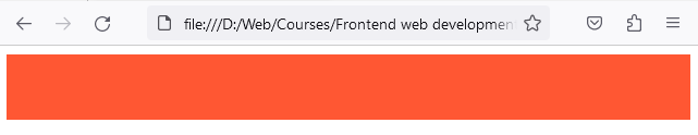
HEX is one of the most common methods to define colors in web design. It’s ideal for situations where opacity changes aren't necessary. Short and easily copy-pasteable, especially with shorthand versions (e.g., #FFF for white)
Shorthand HEX
Some colors can be shortened:
color: #fff; /* same as #ffffff */
color: #000; /* same as #000000 */
Why HEX Is Popular
- Compact
- Easy to copy from design tools
- Widely supported
- Supports transparency with 8-digit HEX (#RRGGBBAA)
- ⚠️ But many beginners find rgba() easier to read.
/* 8-digit HEX = #RRGGBBAA */
.overlay {
  background-color: #00000080; /* black at ~50% opacity */
}
RGB Values
RGB stands for Red, Green, Blue — the primary colors of light on screens. In CSS, colors can be defined using the rgb() function, where values for red, green, and blue are provided in the range of 0-255.
Example:
div {
    background-color: rgb(0, 0, 0); /* This is black */
}
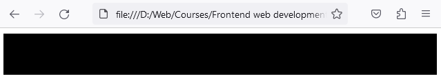
Using rgb() directly relates to the red, green, and blue light components, making it more intuitive for some. Often used in software that deals with screen displays and images.
Another Example:
p {
    color: rgb(255, 0, 0); /* Red */
}
When to Use RGB
✔ When working closely with image editors
✔ When converting design specs
✔ When transparency isn’t required
RGBA Values (RGB + Alpha)
RGBA is similar to RGB but has an additional value for alpha (A) representing opacity.
Alpha values range from:
- 0 → fully transparent
- 1 → fully opaque
Example:
div {
    background-color: rgba(0, 0, 0, 0.5); /* Semi-transparent black */
}
In this example we are specifying the red, green and blue channels to zero, while adding a 50% opacity, hence we get a partly transparent background.
Use when you need to specify the opacity of a color. Useful for hover effects, modal backgrounds, or any overlaying component where you want the background to be partly visible.
Common Use Cases
✔ Modal overlays
✔ Hover effects
✔ Tooltips
✔ Layered UI elements
RGBA is extremely common in modern UI design.
Opacity vs Alpha (common beginner confusion)
Opacity affects the whole element, including its children. Alpha affects only that one color value.
Code example:
/* Opacity affects EVERYTHING inside the element */
.card-opacity {
  background: red;
  opacity: 0.5;
}

/* Alpha affects only the background color */
.card-alpha {
  background: rgba(255, 0, 0, 0.5);
}
Explanation:
- With opacity: 0.5, your text becomes transparent too
- With rgba(..., 0.5), only the background becomes transparent
HSL Values
HSL stands for Hue, Saturation, Lightness — a format designed to be more intuitive for humans.
HSL Breakdown
- Hue → color type (0–360 degrees)
- Saturation → color intensity (%)
- Lightness → brightness (%)
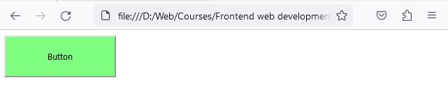
Example:
button {
    background-color: hsl(120, 100%, 50%); /* Pure green */
}
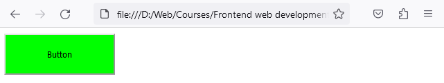
Allows for easier theme changes. Altering the lightness or saturation while keeping the hue can give a different feel to a design while remaining consistent. Easier to understand in terms of human perception. Adjusting saturation and lightness can be more intuitive than tweaking RGB values.
Why HSL Is Powerful
✔ Easy theming
✔ Simple brightness adjustments
✔ Intuitive color tweaking
Changing only lightness or saturation lets you create consistent variations of the same color.
HSLA Values (HSL + Alpha)
Like RGBA, HSLA includes an alpha value for opacity. HSLA combines the readability of HSL with transparency control.
button {
    background-color: hsla(120, 100%, 50%, 0.5); /* Pure green */
}
Combines the benefits of HSL with the transparency feature, offering both themability and opacity controls. Useful when you need a deeper level of control over both color and transparency, especially in layered designs.
Best Use Cases
✔ Design systems
✔ Color themes
✔ Layered backgrounds
✔ Hover and focus states
HSLA is excellent for scalable and maintainable CSS.
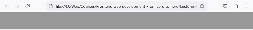
Applying Colors in CSS
.card {
  color: #333;                 /* text color */
  background-color: #f5f5f5;   /* background */
  border-color: #ddd;          /* border */
  outline-color: #1e90ff;      /* focus outline color */
}
These are the most common properties where you’ll use colors: text, backgrounds, borders, and focus outlines.
Color Accessibility (Important!)
Good color design isn’t just about aesthetics — it’s about readability and inclusivity.
Key Accessibility Tips
- Ensure enough contrast between text and background
- Avoid using color alone to convey meaning
- Test designs in grayscale
- Respect user preferences (dark mode, high contrast)
📌 A good rule:
If you squint and still can’t read it, users won’t either.
AA contrast guideline: 4.5:1 for normal text, 3:1 for large text (18px+ bold or 24px+ regular)
Choosing the Right Color Format
| Situation | Best Choice |
|---|---|
| Simple text color | HEX |
| Transparency needed | RGBA / HSLA |
| Theme-based design | HSL / HSLA |
| Quick demo | Named colors |
| UI overlays | RGBA |
Best Practice: Store Colors in CSS Variables
It keeps your design consistent, makes theme changes easy, and prevents “random color spaghetti”.
Example:
:root {
  --color-text: #222;
  --color-bg: #fff;
  --color-primary: hsl(210, 90%, 50%);
  --color-border: rgba(0, 0, 0, 0.12);
}

body {
  color: var(--color-text);
  background: var(--color-bg);
}

.button {
  background: var(--color-primary);
  border: 1px solid var(--color-border);
}
Now if you want a new theme, you only change values in :root.
Color Palette Tip: Use “one hue, multiple lightness levels”
:root {
  --primary-300: hsl(210, 90%, 70%);
  --primary-500: hsl(210, 90%, 50%);
  --primary-700: hsl(210, 90%, 35%);
}
Same hue, different lightness → consistent palette.
Common Beginner Mistakes
❌ Using only named colors
❌ Ignoring contrast ratios
❌ Hardcoding too many unrelated colors
❌ Using RGB when HSL would be easier
What’s Next
In the next lesson, we’ll explore the CSS Box Model — one of the most important concepts in layout design.
You’ll learn how margin, border, padding, and content work together to control spacing and structure.
🎯 Mastering colors + the box model = visual control unlocked.