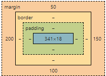
The CSS Box Model
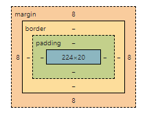
In CSS, each HTML element is considered as a box that consists of margins, borders, paddings, and the actual content. This is known as the "box model". The CSS Box Model is a fundamental concept for understanding the design and layout of webpages. It surrounds every HTML element and includes: content, padding, border, and margin.
- Content: This is the actual content of the box where text and images appear.
- Padding: This clears an area around the content within the box. The padding is transparent.
- Border: This is a line that goes around the padding and content.
- Margin: This clears an area outside the border. The margin is transparent.
Controlling Box Model Properties
You can control the width and height of each part of the box model using their respective CSS properties: width, height, padding, border, margin.
width
height
padding
border
margin
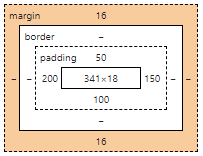
Standard Box Model Calculation (Default)
By default, CSS uses the content-box model, meaning:
It's important to note that by default, the total width and height of an element is calculated as:
Total width = width + left padding + right padding + left border + right border + left margin + right margin
Total height = height + top padding + bottom padding + top border + bottom border + top margin + bottom margin
This is known as the standard box model. However, CSS offers a property called box-sizing which can change this calculation. If you set box-sizing: border-box;, any padding or border specified in CSS will be included in the width or height of the element.
Let's create a div and apply different box model properties:
HTML
<div class="box">Hello, world!</div>
CSS
.box {
  width: 200px;
  padding: 10px;
  border: 5px solid black;
  margin: 20px;
}
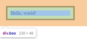
➡️ Actual rendered width:
- Content: 200px
- Padding: 20px
- Border: 10px
Total = 230px (margin adds space outside)
This default behavior is the reason many beginners feel confused when layouts “randomly” overflow or don’t fit their containers. You set width: 200px, but visually the element becomes wider because padding and borders are added on top of that width.
box-sizing: border-box (Highly Recommended)
CSS gives us a better option: box-sizing: border-box
With this setting, padding and border are included inside the width and height.
.box {
  box-sizing: border-box;
  width: 200px;
  padding: 10px;
  border: 5px solid black;
  margin: 20px;
}
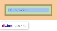
Now, the visible/rendered width of the .box will be exactly 200px, with the padding and border included in this width.
Best Practice
Most modern projects include this rule:
* {
  box-sizing: border-box;
}
It makes layouts predictable and much easier to reason about.
Visual Size vs Logical Size
With the default box model, the number you write in width is not the visual size of the element.
With box-sizing: border-box, the number you write is the final visual size.
That’s why most developers prefer border-box:
- You design layouts visually
- You think in real dimensions
- You avoid surprise overflows
If something feels “off” with sizing, always check:
- Is box-sizing: border-box applied?
- Am I accidentally adding padding or borders?
Width and Height
The width and height properties set the width and height of an element. Here's an example:
div {
  width: 500px;
  height: 200px;
  border: 1px solid black;
}
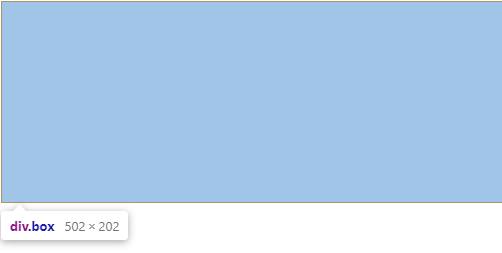
In the example above, the <div> element will have a width of 500 pixels and a height of 200 pixels. Since we are not using box-sizing: border-box, the border adds 1px on each side, increasing the final size, so the total width will be 502px and height 202px.
Min and Max Dimensions
The max-width and min-width properties set the maximum and minimum widths of an element, while the max-height and min-height set the maximum and minimum heights.
Here's an example:
div {
  width: 100%;
  min-width: 300px;
  max-width: 600px;
  min-height: 150px;
  max-height: 300px;
}
In this case, the <div> element will always be at least 300 pixels wide and 150 pixels tall, but it won't exceed 600 pixels in width or 300 pixels in height. Since the width property is set to 100%, the div will always take up the full width within the given constraints and will be fluid.
Absolute vs Relative Units (Quick Recap)
When setting the width and height of elements, you can use both absolute (like px, cm, etc.) and relative units (like %, em, rem, vh, vw, etc.).
Absolute units are fixed, they do not change their size. For example, when you set the width of an element to be 500px, it will always take up 500 pixels on the screen, regardless of the size of the screen or parent element. This can make the layout rigid and non-responsive.
Relative units on the other hand, are relative to another length value. For example, % is relative to the size of the parent element, em is relative to the font size of the current element, rem is relative to the font size of the root element, and vh/vw are relative to the viewport's height/width.
Using relative units can help create a more responsive design.
Here's an example:
.parent {
  width: 60%;
  height: 50vh;
}

.child {
  width: 50%;
  height: 2em;
}
In the example above, the width of .parent is 60% of its parent element (or the viewport if .parent is the root element), and its height is 50% of the viewport height. The width of .child is 50% of the .parent element's width, and its height is twice the font size of .child.
Understanding how to properly use the width, height, and their min/max variations can be key to mastering layout in CSS. Likewise, knowing when to use absolute versus relative units is crucial for creating flexible and responsive web designs.
CSS Margin
Margins are used in CSS to create space around elements, outside of any defined borders. With CSS, you have full control over the margins. There are properties for setting the margin for each side of an element (top, right, bottom, and left).
p {
  margin-top: 50px;
  margin-bottom: 100px;
  margin-right: 150px;
  margin-left: 200px;
}
In the above example, the paragraph has a top margin of 50px, a bottom margin of 100px, a right margin of 150px, and a left margin of 200px.
There's also a shorthand margin property that allows setting all sides at once.
p {
  margin: 50px 150px 100px 200px; /* top right bottom left */
}
Common Use Case
Margins are used to:
- separate sections
- space out cards
- control layout flow
Margin Collapsing (Important to Know)
Vertical margins can sometimes collapse, meaning they don’t add up the way you expect.
When two vertical margins touch, only the larger one is applied, not the sum.
h2 {
  margin-bottom: 40px;
}

p {
  margin-top: 30px;
}
You might expect a total gap of 70px, but the actual space will be 40px, not 70.
This happens because vertical margins collapse between block-level elements.
Important notes:
- Only vertical margins collapse (top and bottom)
- Horizontal margins do not collapse
- Padding and borders prevent margin collapsing
You don’t need to memorize all the rules yet — just remember this exists.
When spacing feels “wrong”, margin collapsing is often the reason.
CSS Border
Borders in CSS can be applied to most elements within HTML. They can be used to define a boundary around an element, for visual appeal, or to separate different sections of a webpage.
CSS provides a number of border properties, including border-style, border-width, border-color, and a shorthand property border which sets the three properties in one declaration.
p {
  border-style: solid; /* style of the border */
  border-width: 1px; /* width of the border */
  border-color: red; /* color of the border */
}
In the above example, a paragraph is given a border that is 1px wide, solid, and red.
Shorthand Border
Shorthand property border can achieve the same in one line.
p {
  border: 1px solid red;
}
Borders are often used for:
- cards
- form fields
- debugging layout issues
CSS Padding
Padding is the space that's inside the element between the element and the border. Padding goes around all four sides of the content and you can target and change the padding for each side with CSS (just like the margin).
p {
  padding-top: 50px;
  padding-bottom: 100px;
  padding-right: 150px;
  padding-left: 200px;
}
In the above example, the paragraph has a top padding of 50px, a bottom padding of 100px, a right padding of 150px, and a left padding of 200px.
Shorthand Padding
A shorthand padding property can be used to set all sides at once.
p {
  padding: 50px 150px 100px 200px; /* top right bottom left */
}
Padding improves:
- readability
- clickable areas
- visual balance
Margin vs Padding — When to Use Which
Margin and padding both create space, but they serve very different purposes.
Margin creates space outside an element.
It pushes elements away from each other.
Padding creates space inside an element.
It gives the content breathing room.
Think of it this way:
- Margin controls distance between elements
- Padding controls comfort inside elements
Practical rule of thumb:
- Use margin to separate sections, cards, or components
- Use padding to make content readable and clickable
.card {
  margin: 20px;        /* space between cards */
  padding: 16px;       /* space inside the card */
  border: 1px solid #ccc;
}
If you ever find yourself using margin to “push text away from the border”, that’s usually a sign padding is the correct tool.
This mental distinction will save you hours of layout frustration later.
Common Beginner Mistakes
- Forgetting padding affects size
- Not using box-sizing: border-box
- Using margins instead of padding (and vice versa)
- Hardcoding widths everywhere
- Forgetting that padding affects clickable area (especially buttons)
Mental Model to Remember
- Margin pushes elements apart
- Padding gives content breathing room
- Border draws attention
- Content holds the actual stuff
If you remember that, you’re already ahead of most beginners.
Pro Tip:
When debugging layout issues, temporarily add this to elements:
* {
  outline: 1px solid red;
}
Seeing the real boxes often explains the problem instantly.
What’s Next
In the next lesson, we’ll explore CSS Floating — an older but still important layout technique that helps you understand how modern layout systems evolved.
After that, we’ll move into positioning, Flexbox, and Grid — where everything starts to come together.