Basic Concept of a Grid System
Grid systems in web design organize content into a series of rows and columns. They make it easy to align and justify content across multiple devices and screen sizes. Bootstrap, for instance, uses a 12-column grid system because it can be easily divided into multiple divisions including halves, thirds, fourths, sixths, and twelfths.
Steps to Create a Grid System
Even though we call this a “grid system”, this approach uses Flexbox to build a column layout system (similar to Bootstrap), not the CSS Grid Layout module from the previous lesson.
Creating the Container
The container centers your content horizontally. It should have a fixed width, and that width should change at different breakpoints. Breakpoints are screen sizes at which your layout will change. For example, one container setup could look like this:
* {
    box-sizing: border-box;
}

.container {
    width: 100%;
    max-width: 960px;
    margin: 0 auto;
}
In this example, we are setting box-sizing to border-box to calculate the borders and paddings inside the width of all elements, and we are setting a .container to the max-width: 960px. Inside of this width our grid system will be applied. The margin: 0 auto; rule is used to center the container horizontally.
Creating Rows
Rows are horizontal slices of the page. In the context of a grid system, they contain the columns. Let's create a CSS rule for rows:
.row {
    display: flex;
    flex-wrap: wrap;
    margin: -15px;
}
The flex-wrap: wrap; rule ensures that columns in the row can wrap onto the next line if there isn't enough space on the current line.
The negative margin is used to counteract the column padding (the gutters) that we’ll add in the next step.
Creating Columns
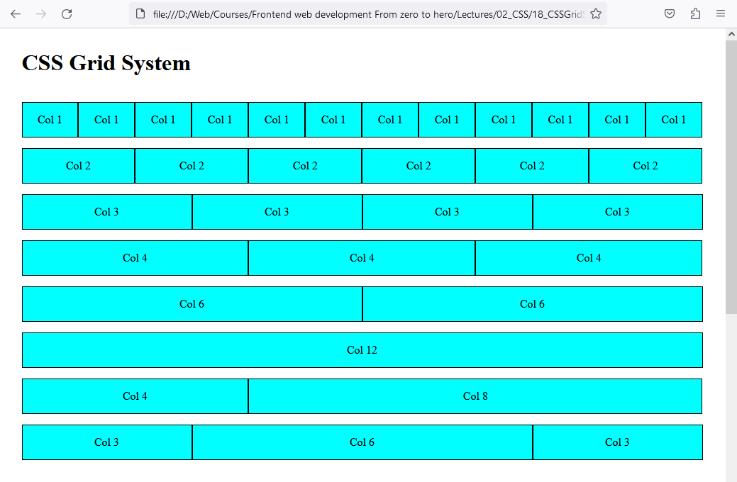
Columns sit inside rows and contain your content. We will create 12 classes, each representing a different column division from 1 to 12. For each column, we'll define a flex and max-width value based on the percentage of the total available width it should occupy. We're assuming a 12-column grid, so each column is 1/12th (or about 8.33%) of the total width. We'll also add a padding to each column to create gutters between columns.
.col-1 { flex: 0 0 8.33%; max-width: 8.33%; padding: 15px; }
.col-2 { flex: 0 0 16.66%; max-width: 16.66%; padding: 15px; }
.col-3 { flex: 0 0 25%; max-width: 25%; padding: 15px; }
.col-4 { flex: 0 0 33.33%; max-width: 33.33%; padding: 15px; }
.col-5 { flex: 0 0 41.66%; max-width: 41.66%; padding: 15px; }
.col-6 { flex: 0 0 50%; max-width: 50%; padding: 15px; }
.col-7 { flex: 0 0 58.33%; max-width: 58.33%; padding: 15px; }
.col-8 { flex: 0 0 66.66%; max-width: 66.66%; padding: 15px; }
.col-9 { flex: 0 0 75%; max-width: 75%; padding: 15px; }
.col-10 { flex: 0 0 83.33%; max-width: 83.33%; padding: 15px; }
.col-11 { flex: 0 0 91.66%; max-width: 91.66%; padding: 15px; }
.col-12 { flex: 0 0 100%; max-width: 100%; padding: 15px; }
The flex: 0 0 <percentage> rule ensures that the column does not grow or shrink beyond the specified percentage, and max-width sets a maximum width to the column.
The padding property creates gutters, or spaces at the edges of the columns. The negative margin we added to the .row class earlier counteracts this.
These classes can now be used in your HTML to determine how wide each column should be, similar to the way Bootstrap does it:
<div class="container">
    <div class="row">
        <div class="col-3">Content for a column that spans 3/12 of the row</div>
        <div class="col-6">Content for a column that spans 6/12 of the row</div>
        <div class="col-3">Content for a column that spans 3/12 of the row</div>
    </div>
</div>
Note that the values for flex and max-width are calculated as follows:(Number of Columns / Total Columns) * 100%.
For example, acol-6 would be (6/12) * 100 = 50%. The padding property is used to create gutters between columns, and we've used 15px for this example, but this can be adjusted based on your design needs.
Implementing Media Queries
Since some of these columns will not be readable on smaller screen sizes, let’s create a breakpoint (Media Query) where we will tell the browser to adjust the width of all columns to a 100% for screen sizes below 768px.
@media screen and (max-width: 768px) {
    .col-1, .col-2, .col-3, .col-4, .col-5, .col-6,
    .col-7, .col-8, .col-9, .col-10, .col-11, .col-12 {
        flex: 0 0 100%; max-width: 100%;
    }
}