Backgrounds in CSS
The background property in CSS allows you to set background colors and images for elements. It is actually a shorthand property for the following individual properties:
- background-color: Sets the background color of an element.
- background-image: Sets one or several background images for an element.
- background-repeat: Defines how background images are repeated.
- background-position: Sets the initial position for each background image.
- background-attachment: Sets whether a background image scrolls with the rest of the page, or is fixed.
- background-size: sets the size of the element's background image.
Background Color
The background-color property specifies the background color of an element. The color can be applied by keyword, HEX, RGB, RGBA, HSL and HSLA.
Example:
div {
  background-color: #999999;
}
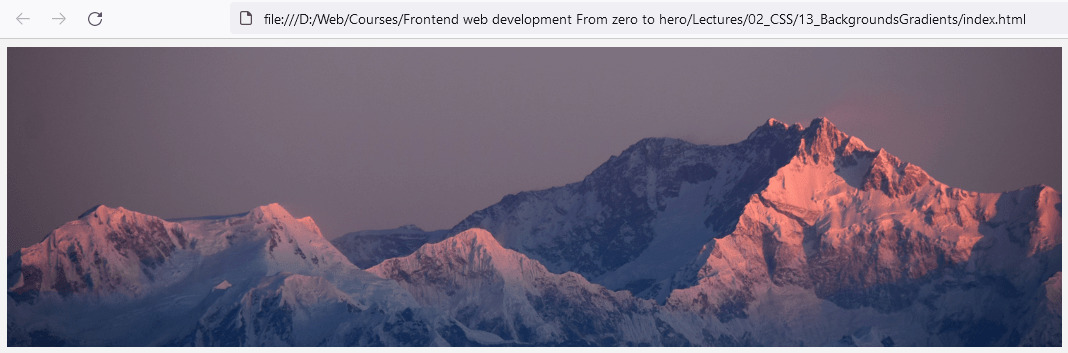
Background Image
The background-image property specifies one or more background images for an element.
Example:
div {
  background-image: url('path-to-image.jpg');
}
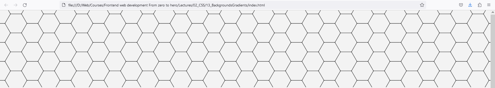
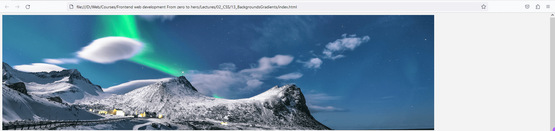
Background Repeat
The background-repeat property defines how background images are repeated. A background image can be repeated along the horizontal axis, the vertical axis, both axes, or not repeated at all. Values include repeat, repeat-x, repeat-y, and no-repeat.
Example:
div {
  background-image: url('path-to-image.jpg');
  background-repeat: repeat;
}
Background Position
The background-position property sets the starting position of a background image. The first value is the horizontal position and the second value is the vertical. Values can be percentages, lengths (px), or keywords (top, bottom, left, right, center).
div {
  background-position: x-axis y-axis;
}
Example:
div {
  background-image: url('path-to-image.jpg');
  background-position: right top;
}
Background Attachment
The background-attachment property sets whether a background image scrolls with the rest of the page, or is fixed. Values include scroll and fixed.
Example:
div {
  background-image: url('path-to-image.jpg');
  background-attachment: fixed;
}
Background Size
The background-size property specifies the size of the background images. Values can be:
- auto (the image keeps its original size)
- cover (the image is resized to cover the entire container, may be stretched or cut)
- contain (the image is resized to fit the container, may be stretched or leave empty space around)
- lengths (px) or percentages (%)
Example:
div {
  background-image: url('path-to-image.jpg');
  background-size: cover;
}
Now let’s put all of this together.
<style>
   body {
      background-color: lightblue; /* sets the background color */
   }

   div {
      background-image: url('path-to-image.jpg'); /* sets the background image */
      background-repeat: no-repeat; /* prevents the image from repeating */
      background-position: right top; /* positions the image */
      background-size: cover;
   }
</style>
In this example, the body background color is set to 'lightblue', and a background image is set for a div which will not repeat and will be positioned at the top right corner of the div.
CSS background properties are essential for improving the visual appeal of the web page and for creating engaging user interfaces.
Here’s a more complex example:
HTML
<div class="wrapper">
    <div class="div-1 original"></div>
    <div class="div-2 col-1-4"></div>
    <div class="div-3 col-1-4"></div>
    <div class="div-4 col-1-4"></div>
    <div class="div-5 col-1-4"></div>
</div>
CSS
.wrapper .col-1-4 {
   float: left;
   width: 25%;
   height: 300px;
   margin-top: 20px;
   background: transparent url('path-to-image.jpg') no-repeat scroll center center;
}
div.div-1.original {
    width: 600px;
    height: 400px;
    margin: 0 auto;
    background: transparent url('path-to-image.jpg') no-repeat scroll center center;
}
div.div-2.col-1-4 {
       background-size: 50% 60%;
}
div.div-3.col-1-4 {
      background-size: 100%;
}
div.div-4.col-1-4 {
      background-size: 100px;
}
div.div-5.col-1-4 {
      background-size: 200px 80px;
}
As can be seen in the example above, images with sizes set in relative units scale when the browser size changes, which can significantly assist in responsive web design.
Background Shorthand Property
The background shorthand property can be used to specify all background properties in a single line.
Advanced shorthand CSS background properties can control the position, size, and repetition of background images.
body {
  background: #f2f2f2 url('path-to-image.jpg') no-repeat center center fixed;
  background-size: cover;
}
In the example above, the background shorthand property sets the source, repeat, position, and attachment of the background image. The background-size: cover scales the image as large as possible without stretching the image.
Multiple backgrounds
In CSS, it's possible to apply multiple backgrounds to a single element using the shorthand property for background. This can be especially useful for layering patterns, colors, and images.
When defining multiple backgrounds, you list them consecutively, separated by commas.
background: [background1], [background2], ...;
Each [backgroundX] can be broken down into:
[background-image] [background-position] / [background-size] [background-repeat] [background-origin] [background-clip] [background-attachment] [background-color];
You don't have to specify all these values; defaults will be used for unspecified values.
div {
    background:
        url("overlay.jpg") no-repeat scroll center center,
        url("pattern.png") repeat scroll 0 0,
        linear-gradient(to bottom, #000000, #ffffff) no-repeat;
}
The backgrounds are layered in the order they are declared, meaning the first background is on top. In the above example, overlay.jpg will be the topmost layer, pattern.png will be under it, and linear-gradient will be the bottom-most layer.
When using multiple background images, only the last instance can have a background color. You can layer as many background images as you want, but be cautious about performance and readability
Gradients in CSS
Gradients in CSS are made up of two or more colors that smoothly transition from one color to another. CSS allows you to create two types of gradients:
- Linear Gradients: A linear gradient is defined by an axis. The colors smoothly transition along this axis from one color to the next.
- Radial Gradients: A radial gradient starts at a single point and emanates outwards.
Linear Gradients
The linear-gradient() function creates an image consisting of a progressive transition between two or more colors along a straight line.
div {
  background: linear-gradient(red, yellow);
}
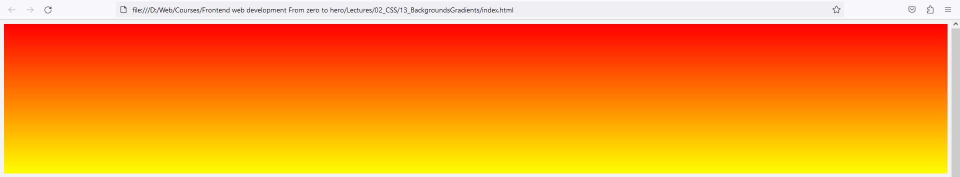
This sets a linear gradient on the div that transitions from red to yellow.
By default the linear gradient moves from top to bottom, you can change this using keywords to right, to left, to top or to bottom before specifying the gradient colors.
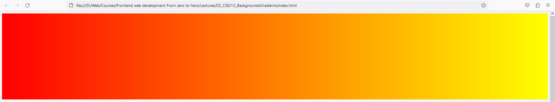
div {
  background: linear-gradient(to right, red, yellow);
}
Here’s an example of various options the linear-gradient() function can support:
/* A gradient tilted 45 degrees,
   starting blue and finishing red */
linear-gradient(45deg, blue, red);

/* A gradient going from the bottom right to the top left corner,
    starting blue and finishing red */
linear-gradient(to left top, blue, red);

/* Color stop: A gradient going from the bottom to top,
   starting blue, turning green at 40% of its length,
   and finishing red */
linear-gradient(0deg, blue, green 40%, red);


/* Color hint: A gradient going from the left to right,
   starting red, getting to the midpoint color
   10% of the way across the length of the gradient,
   taking the rest of the 90% of the length to change to blue */
linear-gradient(.25turn, red, 10%, blue);


/* Multi-position color stop: A gradient tilted 45 degrees,
   with a red bottom-left half and a blue top-right half,
   with a hard line where the gradient changes from red to blue */
linear-gradient(45deg, red 0 50%, blue 50% 100%);
Radial Gradients
The radial-gradient() function creates an image consisting of a progressive transition between two or more colors that radiate from an origin. Its shape may be a circle or an ellipse.
div {
  background: radial-gradient(red, yellow);
}
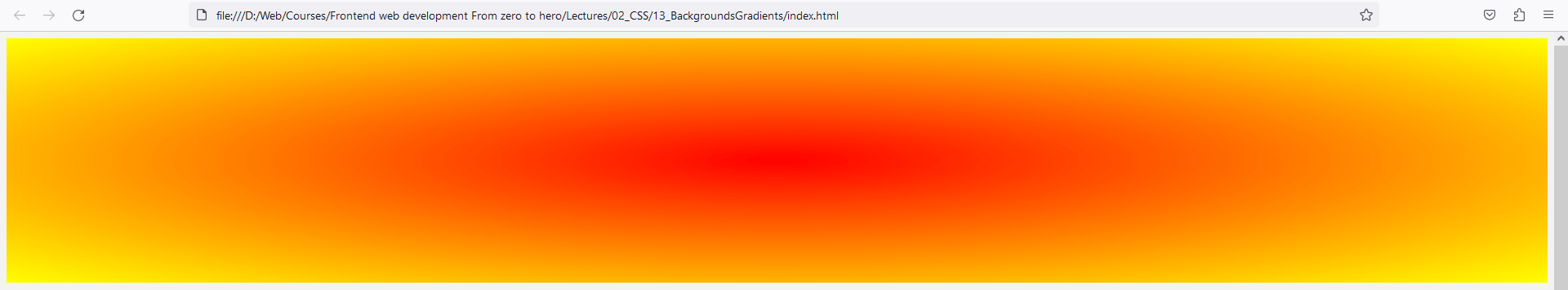
This sets a radial gradient on the div that starts with red in the center and transitions to yellow as it moves outward.
Here’s an example of various options the radial-gradient() function can support:
/* A gradient at the center of its container,
   starting red, changing to blue, and finishing green */
radial-gradient(circle at center, red 0, blue, green 100%);

/* A gradient at closest side of its container */
radial-gradient(closest-side, #3f87a6, #ebf8e1, #f69d3c);

/* A gradient at the 100% of its container */
radial-gradient(circle at 100%, #333, #333 50%, #eee 75%, #333 75%);

/* A gradient using ellipse at top of its container */
radial-gradient(ellipse at top, #e66465, transparent);
A radial gradient is specified by indicating the center of the gradient (where the 0% ellipse will be) and the size and shape of the ending shape (the 100% ellipse).